
Get paid
TO GAME

user centered design, gaming design, UI/UX

REAL MONEY GAMING
Redesigning IMBR to SoStronk: A Real Money Gaming App
introduction
IMBR was a gaming app that allowed users to participate in multiplayer matches and tournaments, with the option to wager real money on the outcome. The app was initially successful but faced several design and user experience issues that needed to be addressed. As a result, the decision was made to rebrand the app and redesign it from the ground up, resulting in the creation of SoStronk.
scope
Changes and Differences: The redesign project involved several key changes and differences from the original IMBR app, including:
-
Branding and Identity:
-
The app was rebranded as SoStronk, with a new logo, color palette, and visual identity.
-
The new branding was designed to be more modern and appealing to a wider audience, with a focus on professionalism and legitimacy.
2. User Experience and Navigation:
-
The app's user interface was redesigned to be more intuitive and user-friendly, with a simplified navigation structure and clearer information architecture.
-
New features were added to the app, including real-time match tracking, improved matchmaking algorithms, and better integration with social media platforms.
3. Visual Design and Aesthetics:
-
The app's visual design was overhauled, with a new color scheme, typography, and iconography.
-
The new design was created to be more cohesive and consistent, with a focus on legibility and ease of use.
4. Technical Improvements:
-
The app's technical infrastructure was improved, with better server architecture and more efficient code.
key features
-
Matchmaking: A feature that allows users to easily find and join competitive matches with other players based on their skill level and preferences.
-
Gaming Statistics: A feature that provides users with detailed statistics about their performance in matches and how they compare to other players on the platform.
-
Anti-cheat System: A feature that ensures fair play by detecting and preventing cheating in matches.
-
Payment System: A feature that allows users to withdraw/add cash to your wallet using UPI and banking.
-
User Profiles: A feature that allows users to create and customize their profiles with personal information, gaming preferences, and statistics.
target audience
The target audience for the SoStronk app is primarily gamers who enjoy competitive gaming and are looking for a platform that offers features like match-making, gaming statistics.
why gamers love SoStronk ?


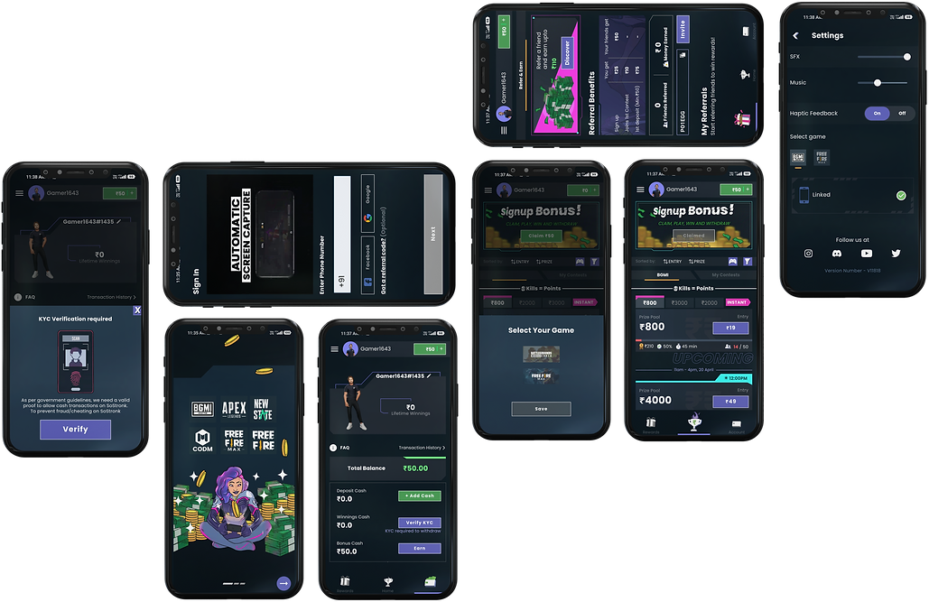
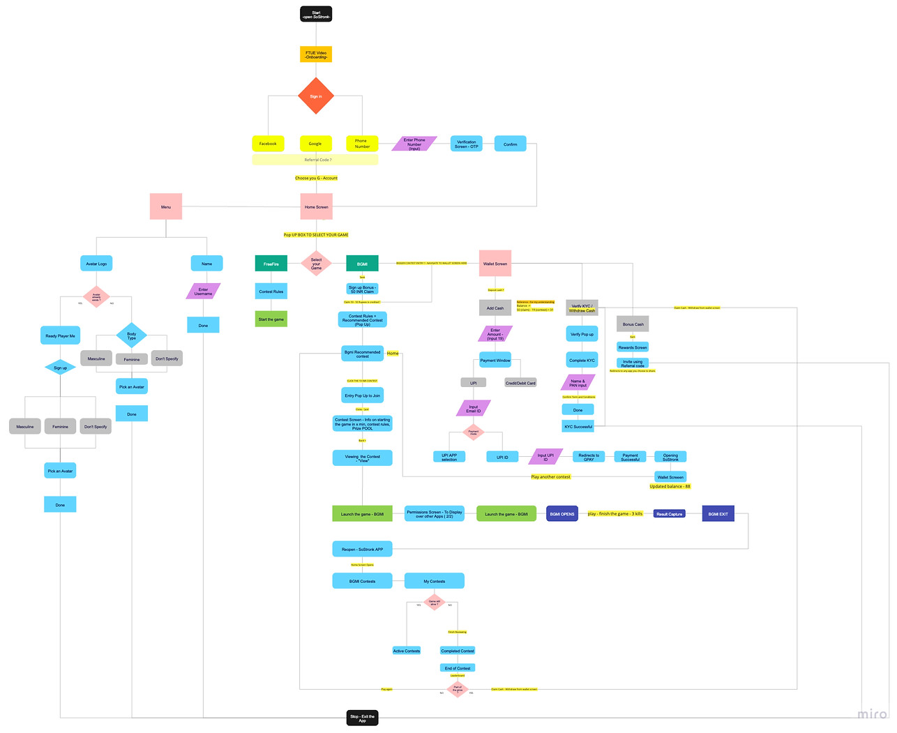
user flow
design language
The design language of the SoStronk app is characterized by a modern and sleek aesthetic that reflects the platform's focus on competitive gaming.
Some of the key design elements that contribute to the overall look and feel of the app include:
-
Color Scheme: The color scheme of the SoStronk app is predominantly dark, with shades of black, gray, and white. This creates a bold and edgy look that is reminiscent of the gaming world. Brighter accent colors like blue and red are used sparingly to draw attention to important elements like buttons and notifications.
-
Typography: The typography of the SoStronk app is clean and simple, with Poppins font that is easy to read on screens of all sizes. Bold headings and subheadings are used to break up long blocks of text and guide users through the app's various features.
-
Iconography: The iconography of the SoStronk app is minimalistic and highly functional. Simple, recognizable symbols are used to represent different functions like messaging, notifications, and settings. This makes it easy for users to navigate the app and quickly find what they are looking for.
-
Layout: The layout of the SoStronk app is designed to be intuitive and user-friendly. Important information is presented prominently on the screen, with menus and buttons that are easy to access and use. The app uses a card-based interface that allows users to swipe left and right to move between different sections.
-
Animations: The SoStronk app makes use of subtle animations and transitions to enhance the user experience. For example, buttons and menus are highlighted when clicked or tapped, and new pages slide in from the side to create a seamless transition between different sections of the app.
Overall, the design language of the SoStronk app is highly effective in conveying the platform's focus on competitive gaming. The dark color scheme, clean typography, and minimalistic iconography all work together to create a modern and visually appealing experience for users.
color scheme

typography
Poppins is the primary font used in the SoStronk app, and it is a modern and geometric sans-serif typeface. Here is a brief overview of the font and its usage in the app:
-
Font Characteristics: Poppins has a clean and minimalistic design, with rounded corners and a wide range of weights and styles. It is easy to read at both small and large sizes, making it a versatile choice for UI design.

-
Sizes: Poppins is used throughout the app at a range of different sizes, depending on the specific use case. For example, it is used for headlines and titles, as well as body text, button labels, and other UI elements.
-
Weight and Style: Poppins is available in a range of weights and styles, including regular, medium, bold, and extra-bold. It is used in bold weights for titles, and in regular or semi bold weights for headings and body text and other UI elements.
my role
As a member of the Design team, my responsibilities included:
-
Collaborating with UI and UX designers, visual designers, and the design director to establish the final look and feel of the application, as well as specific aspects of UX.
-
Working on UI design for certain flows and co-leading UI design for the overall application, in accordance with the previously established research and product strategy.
-
Collaborating with visual designers and the design lead to refine the look and feel of the application.
-
Creating three mascots for the app to enhance its branding and user experience.
-
Working closely with developers to monitor progress and ensure the quality of the design experience.
-
Developing a design library based on the app to maintain consistency throughout the project.

Designing Mascots for SoStronk App
overview
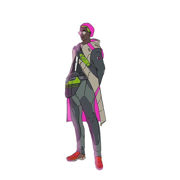
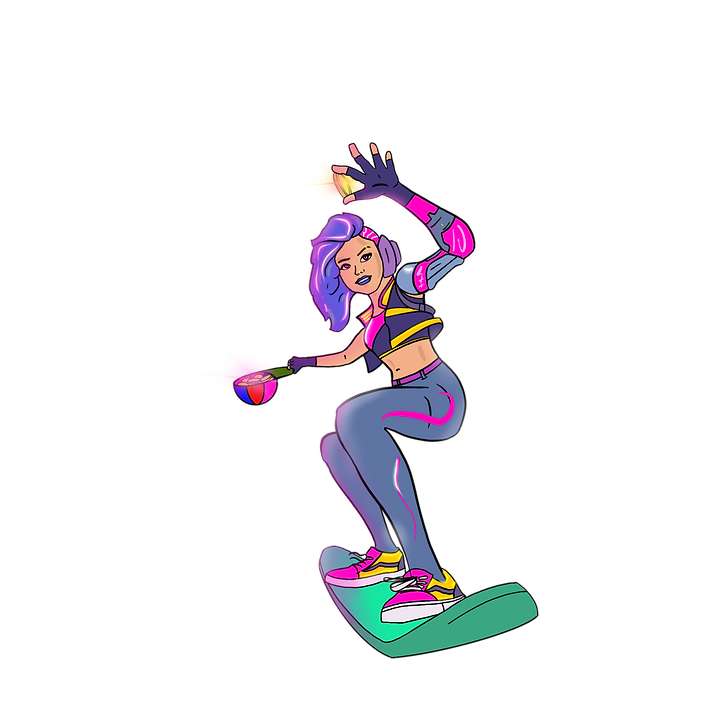
As a designer at SoStronk, I was also given the responsibility of creating three cyber punk themed characters to serve as mascots for the SoStronk app. My goal was to use these characters as visuals to guide users through the app and to make their experience more engaging. Additionally, these characters were also used in short animated videos for first-time user experience.


main mascots
designing the characters
-
I designed three characters - two boys and one girl - to serve as mascots for the SoStronk app.
-
Using my graphic design skills and the pen tool, I created unique gaming suits for each character that had a futuristic and cyber punk-inspired look.
-
The color scheme for each character was carefully chosen to match the overall cyber punk theme of the app, with vibrant colors that represented its futuristic nature.


character assets and their usage
usage

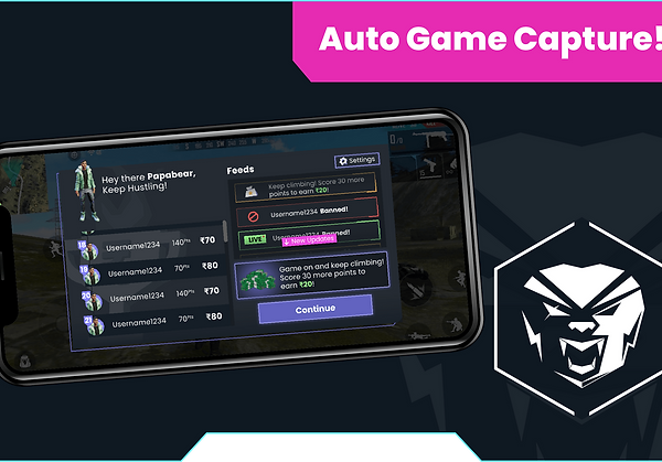
Home Screen Banner
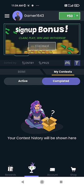
Home Screen Contests

Permissions Settings Page
animated videos
-
My illustrations for the cyber punk themed characters were used in short animated videos to guide first-time users through the app.
-
The team utilized the characters' design language to create an engaging and informative experience for users.
-
The animated videos were an effective way to introduce users to the app and its features, and the characters helped to create a memorable experience that kept users engaged.

miscellaneous assets
-
The SoStronk app features a variety of miscellaneous assets that were designed to enhance the user experience and provide visual feedback on important app functions.
-
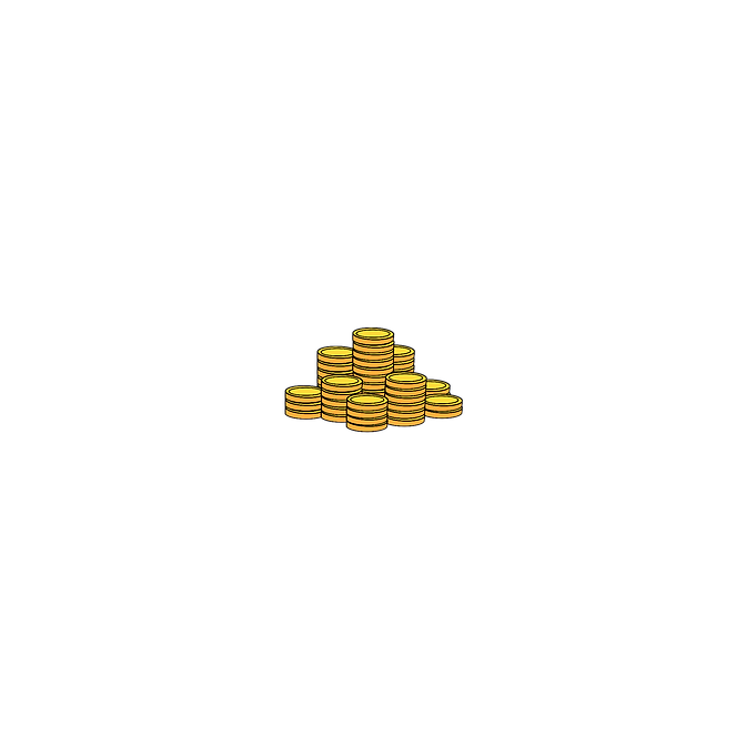
These assets include illustrations of cash and coins to represent in-game currency, as well as a mascot character for the app named "Sostronaut" that appears in various forms throughout the app.
-
The app also includes illustrations of a fistbump, which is used to confirm successful transactions or interactions within the app.
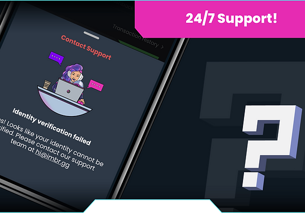
-
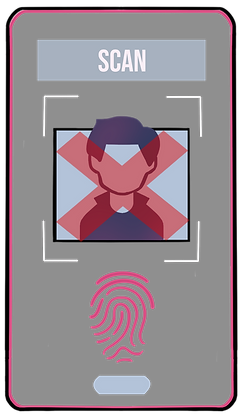
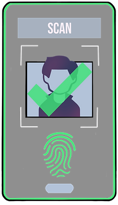
Additionally, the app features illustrations to signify the results of KYC verification, with images depicting successful verification as well as failed verification.
-
The design of these assets was created to be consistent with the overall visual language of the app, using the same color palette, typography, and design style to ensure a cohesive user experience.
-
The illustrations were created with attention to detail, using shading, highlights, and other visual cues to give them a sense of depth and dimension, and to make them feel like an integral part of the app's interface.
Overall, these miscellaneous assets add to the overall visual appeal of the SoStronk app, and help to communicate important information to users in a clear and engaging way.


miscellaneous assets and their usage
usage

Cash Assets to showcase Bonus Cash won

Failed KYC Verification Asset

Banner showing Fist Bump Asset
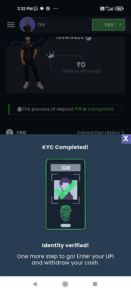
Successful KYC Verification Asset
takeaways and learnings
During my tenure at SoStronk, I had the opportunity to work on a project where I was given the responsibility to lead certain UX flows and tracks, as well as co-lead the visual design. Through this experience, I learned a lot about working effectively in a tight schedule, which involved finalizing the UX for specific flows, managing visual design, creating illustrations, and developing a design system.
Working closely with the development team, design strategist, creative director, and UX designers provided me with a great opportunity to gain a deeper understanding of the business and strategy involved in such an ambitious project. I learned to be much more attentive to ensure that the designs I created not only looked good but were also functional and achievable by the development team. Overall, this experience helped me realize my own capabilities and develop new skills, which I can apply to future projects.
conclusion
The redesign project for IMBR resulted in the creation of SoStronk, a more modern and user-friendly real money gaming app. The changes and differences from the original app were significant, but ultimately helped to create a more compelling and engaging user experience. The success of SoStronk is a testament to the importance of good design and user experience in the development of successful apps and digital products.